Tips for hanging wall art
As a stager I’m in a lot of different homes and one of the biggest opportunities for improvements I see is wall décor. So many pieces are hung too high to be appreciated or is the wrong scale for the furniture. However, most often what I see is wall art that is simply too small for the wall space. Now I know art can be expensive, but it is often the finishing touch needed to perfect the design. In staging wall décor is often used to draw attention away from flaws, cozy up (or even create) a space, or make a ceiling appear taller. There is actually a lot to good placement, so let’s get started with a few tips today.
• Small art work should be reserved for small spaces, or hung in groupings.
– Think of groupings as one piece
– To design a nice grouping lay out the pieces on the floor or table before hanging them on the wall. For larger groupings use butcher paper and trace the configuration including where the nails should be placed. When it’s just right, tape the paper to the wall, insert the nails, hang the décor, tear down the paper and you’ll have a beautifully spaced grouping with no extra holes in the sheetrock.
– Everything should coordinate nicely together. For instance frames or matting should be the same color, or the art work should be of similar nature (all landscapes, or watercolors etc.).
-The grouping does not have to be symmetrical, however its typically harder to find the right balance if there are different sizes
-Space out carefully, too much room and they will look disconnected, not enough and they will look crowded. The larger the art, the larger the wall, the larger the space in between and vice versa – 2 to 4 inches usually works best.
• All wall decor doesn’t have to be art (boring!)
-Use your imagination and frame left over wall paper, children’s masterpieces, maps, postcards, or grandmother’s doilies
-Be unexpected; hang placemats, empty frames, dishes, wire baskets, odd collections, sports equipment
• Please use a level
– For the benefit of us slightly neurotic people who go around homes and office buildings straightening frames
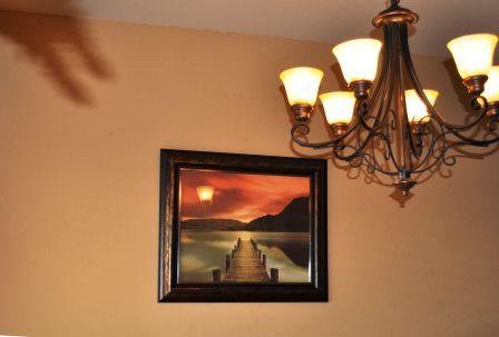
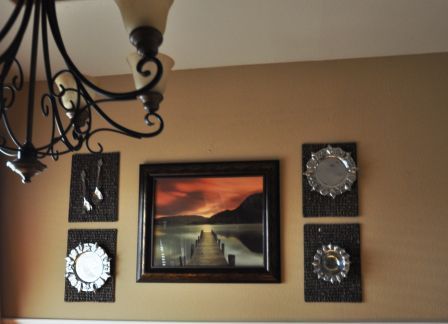
Below, the homeowner wanted to hang a particular print on one particular wall. The colors did coordinate well however it was too small for the wall space and the large dining table dwarfed the print and made it look even smaller (explained more in the next post).
So we hung the home owners ornate silver on top of woven place mats which co-ordinates nicely together. They are different enough to not be in competition with the print and fill the space perfectly.
Hope you learned something or at least enjoyed the read! We’ll finish up discussing wall art next time.