Today I’d like to finish up our discussion on wall art (part 1). My grandmother, the artist will tell you art stands on its own merit – and should not be matched or coordinated to fit the décor of the room. Since my grandmother doesn’t own a computer, I can tell you her granddaughter, the stager, disagrees (sorry Nanny). No we don’t want everything matchy-matchy, but display a bold colored painting over a fireplace, then pull out one or two colors for accessories and throw pillows and see what happens to the energy in the room!
• Large Art creates drama
-If a room doesn’t have a focal point, or you want to add a wow factor to an uninteresting space, use one large, bold statement piece
• Furniture size and placement must be considered when hanging wall art
-There should be 6 to 8 inches between the sofa and the art above it
-Wall décor should never be wider than the furniture below it
-Wall décor should be approximately 75% of the width of the furniture beneath it
**That’s right, either too small or too large is just wrong in every way. If you see an elephant sitting by a mouse what does the eye do? It perceives the elephant larger and the mouse smaller than they actually are since they are side by side. Same way our medium size photo looks tiny compared to our large over stuffed leather sofa. WE MUST HAVE THE RIGHT SCALE!
• The center of the art piece should be hung at eye level
-Whose eye? The average eye, which is 5’4”for women, and 5’9” for men, so it should fall somewhere in between. If in doubt ask a few of your friends what they think.
• Vertically or Horizontally
-Depends on what you want to emphasize and your wall space. For instance if you want the attention on the vaulted ceiling hang a large print vertically to draw the eye up. If you have a wide wall you may want to hang multiple coordinating pieces horizontally to fill the space.
• Room to rest
-Don’t fill every square inch of every wall. Our eyes need time to admire, process and roam to the next beautiful piece.
-If you are fortunate enough to have a lot of wall decor, instead of displaying too much at a time, rotate it with the seasons. Believe me, you will appreciate your loved pieces more and your guest will think you are master of décor.
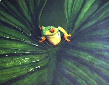
Don’t forget to have a little fun too. This little guy is hung high above a door in what we’ll politely call the water closet. He isn’t even noticed until someone sits down, looks up and spots his smiling green face looking back at them.
Anyone else want to share photos of their wall decor? Classic, creative, unusual and yes even amphibians welcome! 🙂

